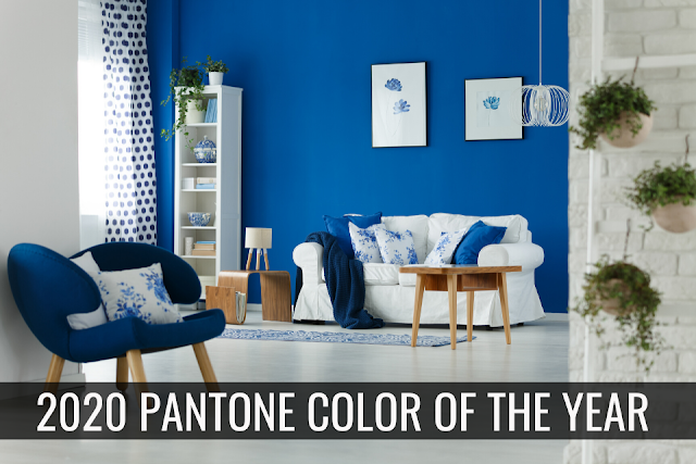
Drum roll please – Pantone has chosen Classic Blue as their color of the year. Over the past couple years, bold colors on walls has become common place in designer magazines and new model homes. Bucking the old guidance of using bland, light hues to make rooms look larger, deep greens, rich reds and even soft blacks are used in even the smallest spaces. This year, Pantone has chosen a fresh Classic Blue to inspire homeowners and designers in 2020.
Classic Blue is just want it sounds like – as classic. Think of your favorite sneaker or school binder and you’ll be right on track. Described as a calming, familiar azure, Classic Blue is an uncomplicated, straightforward tone intended to provide a “neutral” backdrop for modern color palates and urban chic styling.
Modern interior design has been trending towards more unassuming color schemes for furniture, flooring and accents. Kitchens sport sleek white cabinets and subway tile counters and backsplashes. Tone on tone design with urban elements of steel and soft wood tones lend themselves to this fresh blue hue. Pantone suggests that the simple color palate of blue and white is a comforting return to more traditional styling and expects that Classic Blue is the perfect wall color to compliment the Mid-Century and 60s décor that have emerged with a modern twist.
A great weekend project for a room or rooms, Classic Blue would add a fresh look to any space.
Now, as much as I love color, when you paint a rental property, it's just not the same!
Painting for rental property......The goal is to get the property rented, not to make statement or even to use “your” favorite color. It doesn’t really matter what your color preference is, as long as the color you choose makes a potential tenant want to sign a lease. And yes...paint color does matter!
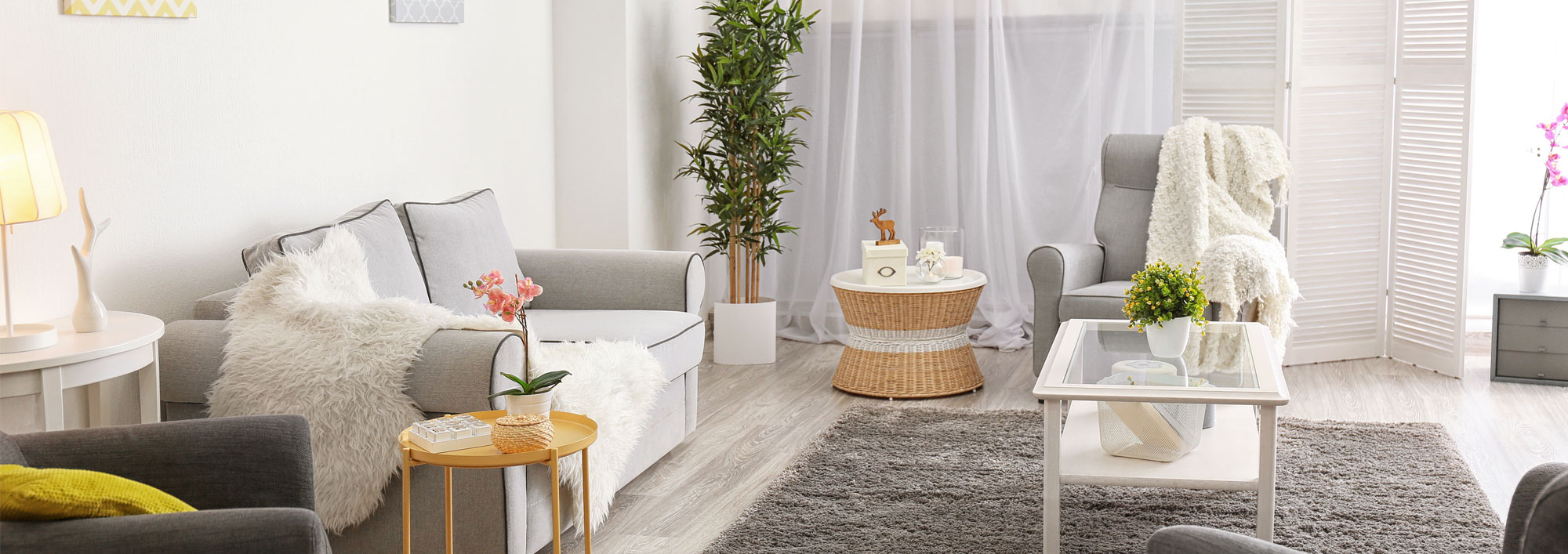
Keep it neutral with colors in the whites, tans, and grays. Here are a few examples of some color swatches from Benjamin Moore:
Manchester Tan, by Benjamin Moore

Decorator’s White, by Benjamin Moore

Cornforth White, by Farrow and Ball
Silver Sage, by Restoration Hardware
Some will say the Gray's are out, however, in my opinion, it opens up the room, especially with white trim and give a light, bright, and airy feel.
My favorite rental property paint colors by Sherwin-Williams are:
Canvas Tan by Sherwin-Williams

Gray Screen by Sherwin-Williams

You may ask, why these particular colors for the walls?
Well, besides being chic and classic, they both are so neutral and work with any furniture colors your tenants add to the rooms.
And for the trim...if you are painting the room, paint all the trim...and POP it with a white!
Highly Reflective White by Sherwin-Williams

Happy Painting!!


